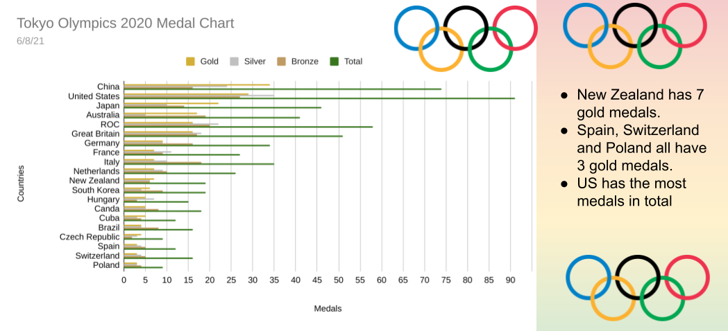
Today I am going to show you me and my friend's Toko Olympics Medal Graph. To collect the data, we gathered info from a slideshow and typed it down on a spreadsheet. To create this graph that represents the top 20 countries who have the most gold medals and here is the graph we ended with:
and my next graph
what is your favourite country in the Olympics?
Hi Daniel
ReplyDeleteI loved your graph about the Olympic medal's, my favourite country was New Zealand, next time can you add more statment's
Lucas
This comment has been removed by the author.
ReplyDeleteMorning Daniel,
ReplyDeleteYour graphs really show the medal totals really well. Maybe with the first graph you could include more information on your statements. Like, Hungry has 1 gold, 1 sliver and 1 bronze in total making them last on the list. I like the way the graph is set out. My favorite country that was in the Olympics was New Zealand. What was your favourite country?
Hi Daniel, Gus here! Amazing Olympic graphs! I really liked how you used different graphs for different days. Awesome! Though, maybe next time you could add a few more statements? Otherwise, amazing! Also, my favourite country in the Olympics is NZ!
ReplyDelete